Before work begins, we need blueprints.
How does it work?
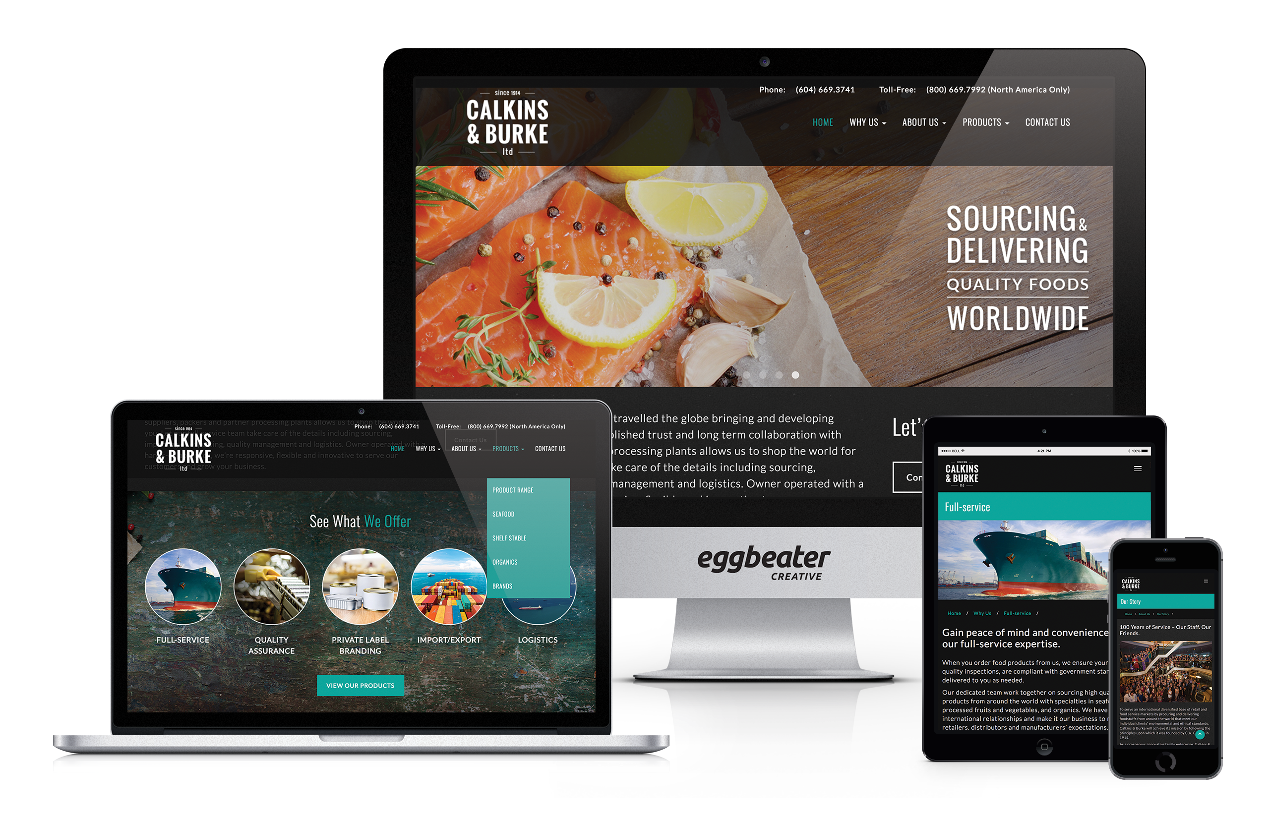
CASE STUDY: a website redesign completed for an established Vancouver company who just happened to be celebrating their 100th anniversary in business.
• • • • • • • • • • • • • • •
Sample Project: Website for Calkins + Burke
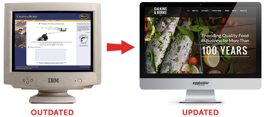
The site looked about as old as the company itself, so we were eager to get started and bring some fresh design styles to an antiquated website.
The following steps are typical parts of The eggbeater Workflow System.
~ ~ ~
1. Research
Get the facts first.
Getting to know your organization, what you want to say and who the target audience is are all crucial aspects to finding solutions that fit. Research includes studying your competition, getting up to speed on your organization and what your brand communicates.
The starting point includes an internal survey that includes questions like:
- What does your target audience look like?
- What are your organization’s greatest strengths?
- Who are your competitors?
- What do you want your website to do?
2. Project Brief
A comprehensive, detailed brief becomes the guiding document for the entire design process, and spells out exactly what we need to do (or don’t do) to get the message out.
Project Brief details include:
- Objectives and goals of the new design
- Budget and schedule
- Target audience
- Scope of the project
- Overall style/look

3. Mood Boards
A mood board is a collection of images and visual samples organized in a way to help define design choices and creative direction.
They help funnel down the choices a designer makes to solve a visual challenge by collecting and consolidating everything from colours and typography to image samples and aesthetic stylings.
A mood board provides an efficient way to define the creative process and target a clear direction that everyone can understand.
4. Site Maps
A site map is a single view diagram of every page of a website.
It is used as a planning tool that lists the pages of a website, typically organized in hierarchical fashion. Sitemaps show relationships between pages, allowing for a bird’s eye view of the entire site. Menu structure takes form and the pathways to content can be explored and analyzed.
Pages can be identified as key pages for use in wireframes and design proofs (see next section).
5. Wireframes
A wireframe is a blueprint for a website.
It is a simple outline that demonstrates what sort of things you can do in your design. A wireframe will show navigation, main buttons, columns and the placement options for elements such as text, images, forms + links.
Wireframes use simple shapes to designate the positioning of content. The goal is to “fit” the elements into a layout, not to indicate how elements may actually appear in a final design.
Wireframes have no design applied to them and are used to diagnose usability, navigation and content areas.

6. Content Document
A Content Document contains ALL the necessary copy, images, files and links that make up the content of your website.
At Eggbeater, we use an online tool called GatherContent, that allows multiple collaborators to gather, add and edit content from any location.
Content Documents corresponds exactly to the number of pages in a site.
Without a clearly structured web content document, you run the risk of confusing content reviewers, designers, and developers. And that confusion can lead to mistakes, frustration and inflated costs. GatherContent mitigates these issues and keeps your project moving smoothly.

7. Concepts
This is when the real fun begins.
All of the planning, strategy and research has been completed, so it’s up to our designers to make the content come to life. Colour, typography and image choices that were identified in the mood board phase are implemented and balanced against the structure identified from the wireframes.
Concepts are always provided in a digital format and may be included in a Design Proof document. Web proofs are always uploaded so that it’s easy to view the scale of the content online.
8. Final Checklist | Review
At the conclusion, eggbeater delivered to this project:
- Competitive Analysis
- Usability Strategy
- Brand Update
- Website Design
- WordPress Development
- SEO Implementation
- Hosting, Testing + Launch
- Ongoing Support
And followed a process that ensured we had clear direction with efficient pathways:

The Finished Product
An awesome end result… made right, from the bottom to the top.
