Return to Greatness: Toronto Blue Jays Logos Over the Years

Toronto Blue Jays Team Logo Has Returned to Greatness After Years of Questionable Choices

The Toronto Blue Jays logo has endured five distinct rebrands over the years. This post is an examination of those changes from the perspective of someone who grew up watching games from the left field bleachers at Exhibition Stadium back in the day.

This is another installment of our on-going series on sports logos.

~ ~ ~

The Original Logo 1977-1996:
The Toronto Blue Jays are Canada’s only remaining major league baseball team. They emerged as a part of the 1977 MLB expansion with the Seattle Mariners and quickly built a solid and competitive team.

By the late 80’s the Jays were challenging for the American League Pennant and by the early 90’s they had won consecutive World Series titles, capped by Joe Carter’s legendary walk-off home run.

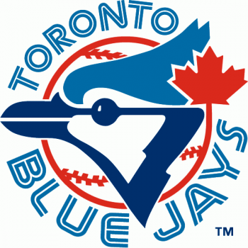
This first wave of achievement for the Blue Jays came while the team wore the legendary original logo on those baby blue uniforms.

VERDICT:

Classic in every way. Iconic lettering and imagery. Anchored by a red-seamed baseball sprouting a red maple leaf and overlaid by the stylized head of a blue jay in profile, this logo possessed all the elements necessary to land the Jays memorably in the imaginations of baseball fans on both sides of the border.

It’s clear, it’s Canadian, and it honors the game of baseball in one simple, connected image.

It won two world championships. Still the O.G.

~ ~ ~

Who wore it best: Dave Stieb, Fred McGriff, Jesse Barfield, The Terminator, Robbie Alomar, Devon White, Paul Molitor, Tony Fernandez, George Bell, and so many more.

The Original Rebrand 1997-1999:

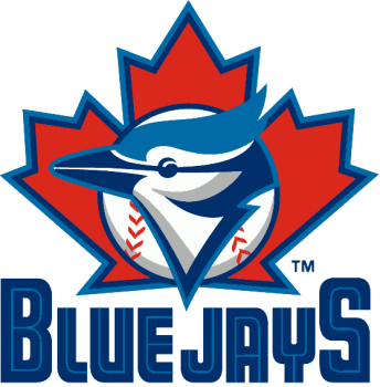
This logo appeared in 1997, twenty years after the Jay joined MLB and a handful of years after their championship teams had crested and the tragedy of the Players Strike sank the hopes for the juggernaut that was the 1994 Montreal Expos team.

MLB was caught between trying to win fans back to the game in the aftermath of the strike while simultaneously sowing the seeds for another self-inflicted disaster by allowing rampant unchecked PED use throughout the league. But that’s another story for another time.

The Jays, meanwhile, were entering the wilderness of what would become more than twenty years mostly meaningless baseball. Ownership changes and listless management meant that fans got to watch some great players – Carlos Delgado, Roger Clemens – squander career years on rosters filled out by lesser talent.

VERDICT:

Unnecessary rebrand. It unintentionally signalled the beginning of the Jays’ two-decades-long wander through the wilderness of professional sporting futility.

Likely intended as a quick cash grab by ownership in order to sell jerseys and other merch as much as it was a way to get some attention in a crowded market this logo has all the warmth and appeal of a mandatory corporate outing on a windy day.

The new emphasis on the red maple leaf as a backdrop and the abandonment of the original lettering sends a confusing message to fans and players. And the Jays in profile seems stunned and somehow incomplete.

The glory days were officially over.

~ ~ ~

Who wore it best: Carlos Delgado, Roger Clemens, Pat Hentgen.

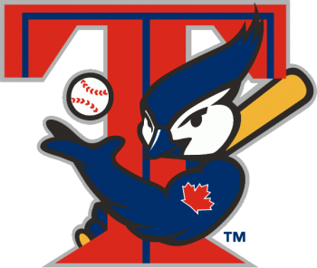
The Alternate Logo 2000-2003:

This logo appeared on team ball caps during spring training that year and also during batting practice in 2000.

This logo made its way into exclusive use during Roy Halladay’s 22-win Cy Young Award winning season in 2003.

VERDICT:

NOPE.

The Jays had resigned themselves to placing third in the American League East during these years, wasting the prime of Roy Halladay’s career by trotting out mediocrity on both sides of the plate.

This logo reflected the team’s competitive indifference perfectly as it continued to distanced itself from the coherence of the original championship logo.

The best that can be said about this logo is that it predicted the amazing Birds with Human Arms meme while also representing an historic low-point in typography use for any professional sports team anywhere ever.

The maple leaf tattoo on the left bicep of the Blue Jay seems like an after thought. This logo has no nuance. It’s soulless and what’s with the rippling forearm?

Please just make it go away.

~ ~ ~

Who wore it best: Carlos Delgado, Roy Halladay, Vernon Wells, David Wells.

The Struggle Continues 2004-2010:

The 00’s were a weird time. Everybody was on edge and the Jays’ front office was a mess.

Baseball was struggling under the shadow of the performance enhancing drugs epidemic that would destroy entire careers for marginal players who juiced just to stay in the game and cast doubt over the stats for all-time great players like Barry Bonds and Roger Clemens.

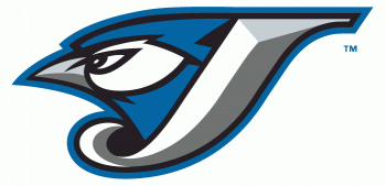
The Jays responded to the zeitgeist with a new logo featuring an angry Blue Jay.

VERDICT:

Arguably better than the previous attempts but that isn’t saying a whole lot.
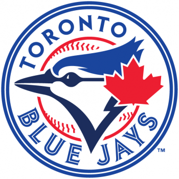
This design abandons the maple leaf and colour red entirely. The blue, grey, and white scheme is balanced and the design work is pretty stellar, but it really lacked the Canadian icon that ties this lone Canadian team together from coast to coast.

During this time the Jays also introduced black jerseys with the word Jays across the chest further removing themselves from the designs, colours, and sensibilities of their past.

This logo and its variants would finally be put to bed in 2011 when the Blue Jays organization decided to take its past and future more seriously.

Editor’s Note: It’s worth pointing out that our designers chose this design as one of the best in a recent Best (and Worst) Logos in Sport post, but that result was based on artistic merit and not tied to how the design fit within the holistic + historic approach to a rebrand. 

~ ~ ~

Who wore it best: Roy Halladay, Carlos Delgado, Edwin Encarnacion, José Bautista.

The Return to Form 2011-today:

The Blue Jays as an organization was turning a corner.

Attendance was bouncing back and soon the Jays would add the Vancouver Canadians, the only major-league baseball-affiliated minor-league team in Canada, as its Northwest league single A short season affiliate.

Paul Beeston was chomping cigars in the President’s office and Alex Anthopoulous was at the controls as General Manager.

There was a brief dalliance with John Farrell. The return of John Gibbons and two consecutive appearances in the post-season.

And there was THE BAT FLIP. A franchise-defining moment that burned itself into the hearts and imaginations of Blue Jays fans across the country and made the Texas Rangers our enemy-for-life.

VERDICT:

A welcome return to the original design aesthetic after years of cold, lifeless, designs-by-committee that had reflected the dire state of the organization during that time.

The design signaled to the fan base and the league that the Jays were focused on the long game of winning.

The Jays itself has sharper features, ‘Toronto’ is a solid dark blue, and the red leaf no longer emerges from the red line of the baseball itself.

It’s a conscious decision to be done with that troublesome middle period of logo experimentation and to return to the past that is achieved not only in the logo design but also on the field as the Jays returned to the post-season two years in a row and provided fans of the game with some of the most dramatic plays the game has ever seen.

Crushed it!

~ ~ ~

Who wore it best: José Bautista, Josh Donaldson, Edwin Encarnacion, Russell Martin, Marcus Stroman.

Share