Best and Worst Sports Logos
 The logos of professional sports teams are almost impossible to avoid in our modern, hyper-mediated times. They scream at you from televisions in restaurants, bombard you from billboards and news advertisements, and are emblazoned on every piece of clothing from caps, to t-shirts, to sneakers.
It’s fun to compare the ones that are really great to the ones that, like their teams during those lean ‘rebuilding’ years, flail uselessly at the bottom of the rankings.
Good, bad – or even worse, mediocre – logos of professional sports teams are powerful symbols of loyalty for a sports brand, representing players, sponsors, the population of the local area, even generations of families.
What makes a sports logo great?
- Design? (“Great artwork!”)
- Historical significance? (“That logo is over 100 years old!”)
- Cultural Connection? (“It’s all about every one of us”)
- Quick + Easy Comprehension? (“I get it!”)
No real spoiler alert here that it’s any one of these or all of the above. And depending on how deep-rooted a team is to its fan base will often negate any discussions about the merit of design, line weight, negative space… all that babble-crap that we designers hold in such high regard.
People’s connection to their team, and the logo that represents it, can go way past artistic ability.
A few examples include:
The NY Yankees
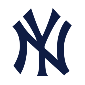
On the surface, The New York Yankees’ iconic “NY” logo is nothing more than some older-world typography, but its roots and the story it tells gives it a design power that can’t be replicated. As detailed in AM New York “The famous interlocking “NY” logo predates the Yankees. It first was designed by Tiffany and Co. as part of a Medal of Valor for John McDowell, an NYPD officer who was shot in the line of duty in 1877.”
~ ~ ~
Baltimore’s Oriole
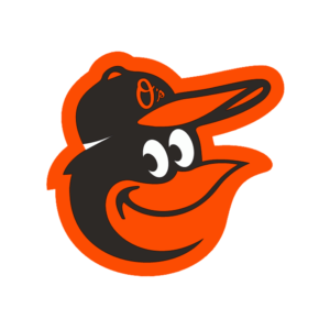
The Baltimore Orioles use a simple kid-friendly cartoon bird that was the work of artist Stan Walsh (creator of Snap, Crackle, and Pop) who created the design in 1966 for team, just in time for their appearance in the 1966 World Series. The team used that logo from 1966 – 1988 and in those 26 years claimed 19 winning seasons, 7 trips to the ALCS, 6 pennants and 3 World Series championships, making the O’s the winningest team in baseball during that span. When the club revised the logo in 1989, and tanked for 14 seasons, the Oriole Cartoon was brought back and beloved by their fans as a symbol of winning ways.
~ ~ ~
Le Club de Hockey Canadien
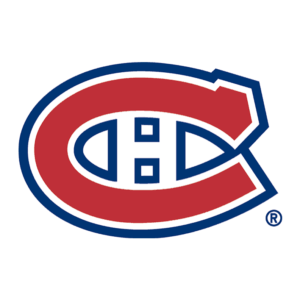 The Montreal Canadians are the winningest team in all of North American professional sports, capturing 24 Stanley Cups over the span of their 120-year history. The iconic “CH” logo (or “HC” logo) are unmistakable symbols of this dynasty, and it would be design-suicide to suggest altering or updating the logo.
Small changes to the design style of this logo has taken place, but the colours and elements have not wavered for generations. “Les habitants” of Quebec and the surrounding St. Lawrence River and Gulf areas wouldn’t have it any other way.
With their long history as a team, the Montreal Canadiens sport a logo that is not only considered iconic, it is also known as one of the greatest logos in sports.
The Best and the Worst
Let’s get to it already! But before we get started, we need to clarify the reasons for the picks we made.
Every logo we’ve chosen here is based on design; the skill, creativity + effectiveness of the artwork.
We’ve omitted historical and cultural connections, and instead focused on the beauty, ability and ease of communication of the artwork itself. For the purposes of the list to follow, it’s all about smart design.
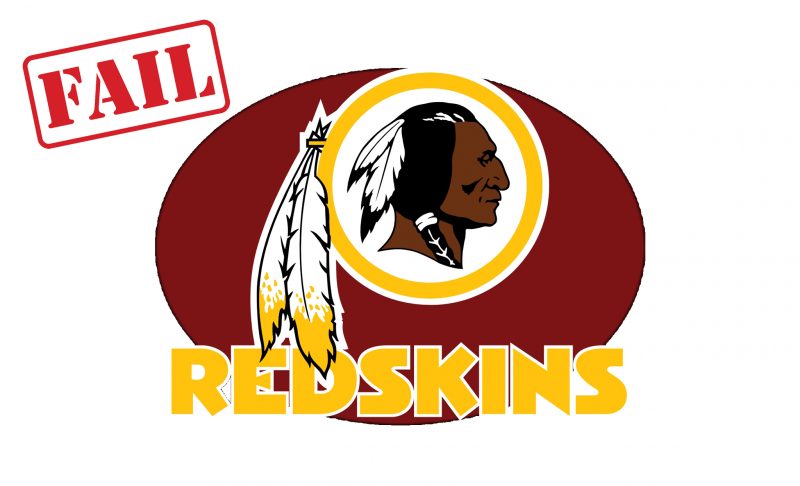
The only deviation from this criteria is if a logo is a racist piece of rat-turd that should have been replaced years ago, it gets pole position on the “Worst” list.
~ ~ ~
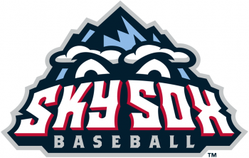 Sky Sox Baseball
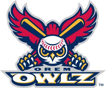 DESIGN NOTES: Fire-inspired wings, classic crossed bats and baseball head with red-stitch brow make this logo a design beauty.
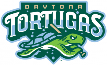 DESIGN NOTES: This logo has great design flow, with an effortless transition from wave-inspired typography to the curves of the mascot. Half-coloured “Tortugas” provides the water level with bubbles scattered throughout the marine palette.
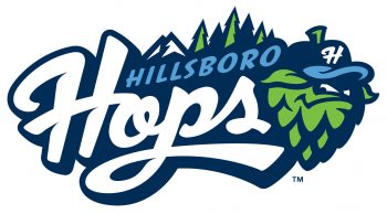 DESIGN NOTES: Superb combination of elements go into this fun logo design: custom typeface, key elements of Oregon state (mountain, trees) with the fast moving, attitude-driven hop in team baseball cap.