The short answer to this question is “it depends”.
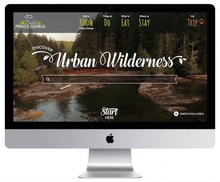
Using a web image as full width on a home page is much different than using a photo in an article post. Trends today are for fixed width images that fill screens at a scale that lets the viewer create an immediate emotional connection. It’s a great way to solidify that first impression.
 But these large and evocative images need to adapt to any screen size, and ensuring they fit without compromising speed is vital. The challenge for us designers/developers is to make sure we build for every screen in use, including Retina displays. Apple has trademarked the use of the word “Retina” to describe the pixel density of a screen to the point where it is difficult for the human eye to discern a single pixel.
If we follow the trends of what Apple chooses to do, then it’s not a bad idea to check in on the image resolutions they have working right now for their fixed width images (like this example).
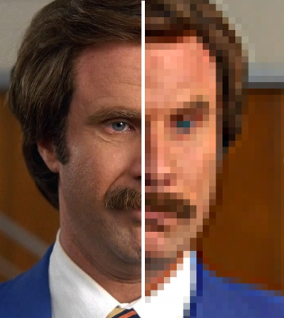
Without too much detail on the differences, Retina screens use a dense pixel formation which results in really sharp and clear images. Any photo viewed on a Retina screen that does not provide enough pixel size, will result in a pixelated and degraded image. To make our job even more challenging, we have to be absolutely certain that these images have minimal impact on load time. This is solved in the way we code the site – ensuring that images that load correspond with screen size of the device viewing the site.
As of this blog post, Apple is using these full-width image sizes:
 Non-Retina:
- 1440px x 678px for Desktop or Laptop
- 1068px x 648px for iPad
- 736px x 460px for iPhone
Retina:
- 2880px x 1356px for Desktop or Laptop
- 2136px x 1296px for iPad
- 1472px x 920px for iPhone
It’s an overview of the ever-moving challenge we face as designers/developers when it comes to image size preparation, and will always need to assess images on a case-by-case basis depending on how best to display them within the chosen site design, but it’s a start.
For now, this should provide some easy guidelines when it comes to assessing the images you want to have viewed at full width on your website. Give your designer a 3000 pixel wide image and watch the happy dance begin.