Zero Zero
branding, packaging and website

The Challenge:
Zero Zero is an established producer of cannabis extract with an existing reputation for high quality products. They required a visual brand that spoke to their natural raw materials, the purity of their lab-based process, and the quality of their product.
Our Solution:
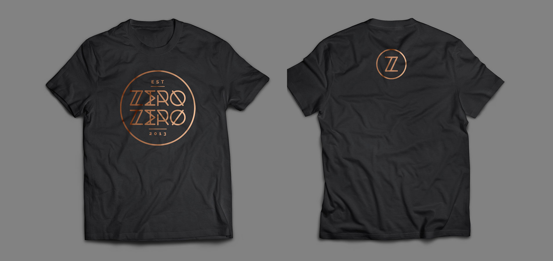
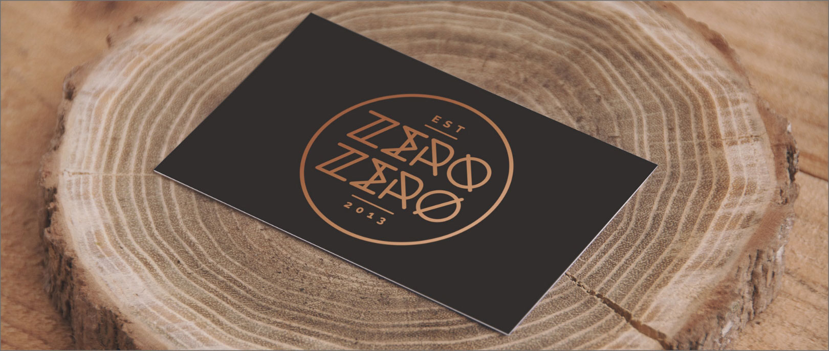
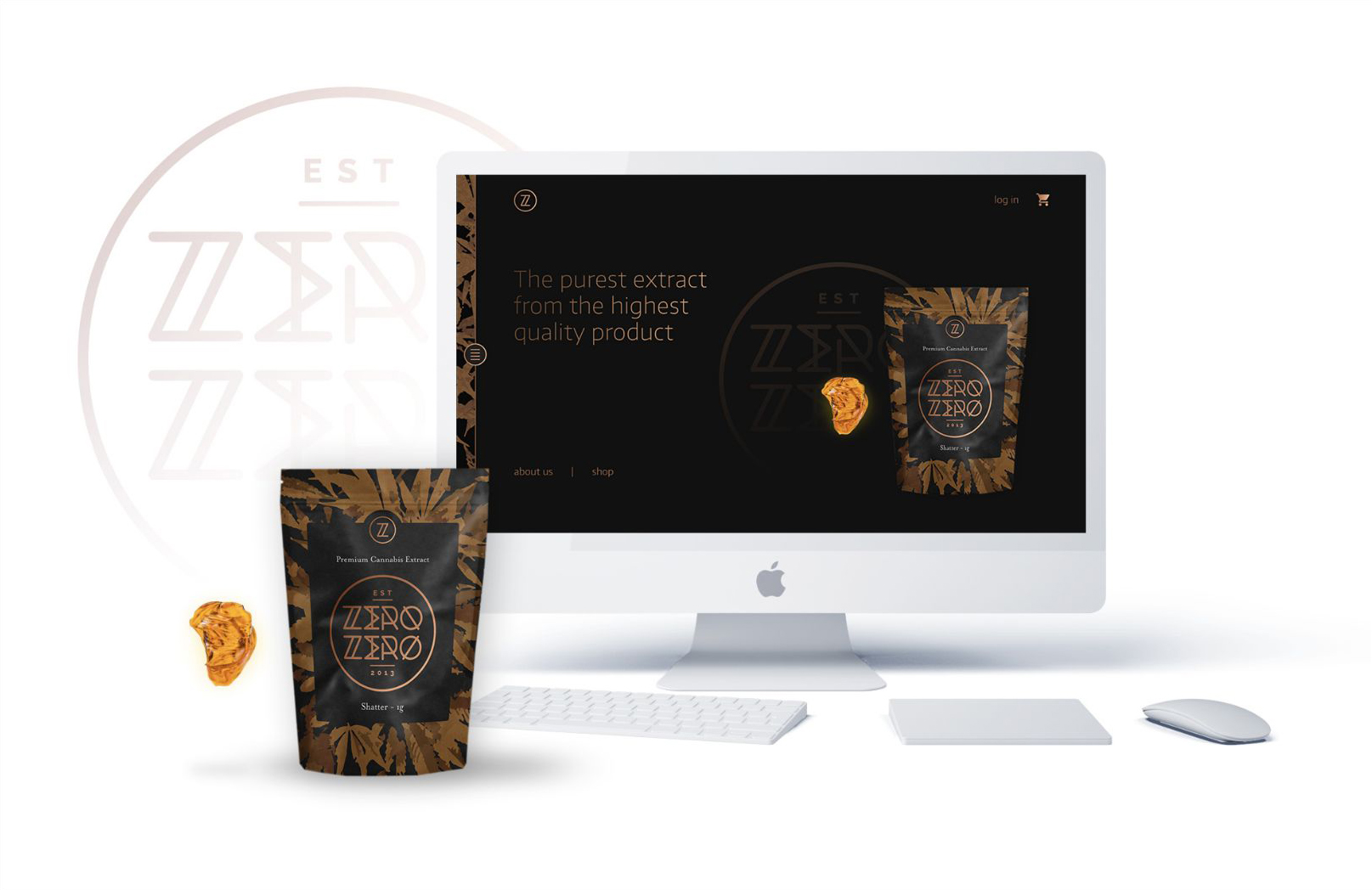
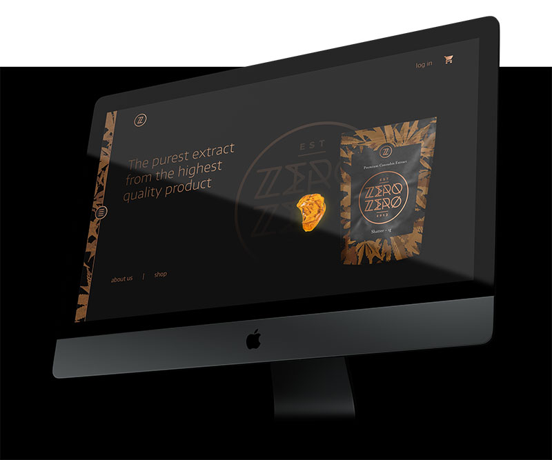
A visual brand was developed that used a precise, technical typeface, combined with a natural leaf-based background pattern. This was produced with a golden metallic sheen over a charcoal grey background to create the look of a modern, prestige retail brand with a strong connection to the natural world.
Branding and Packaging




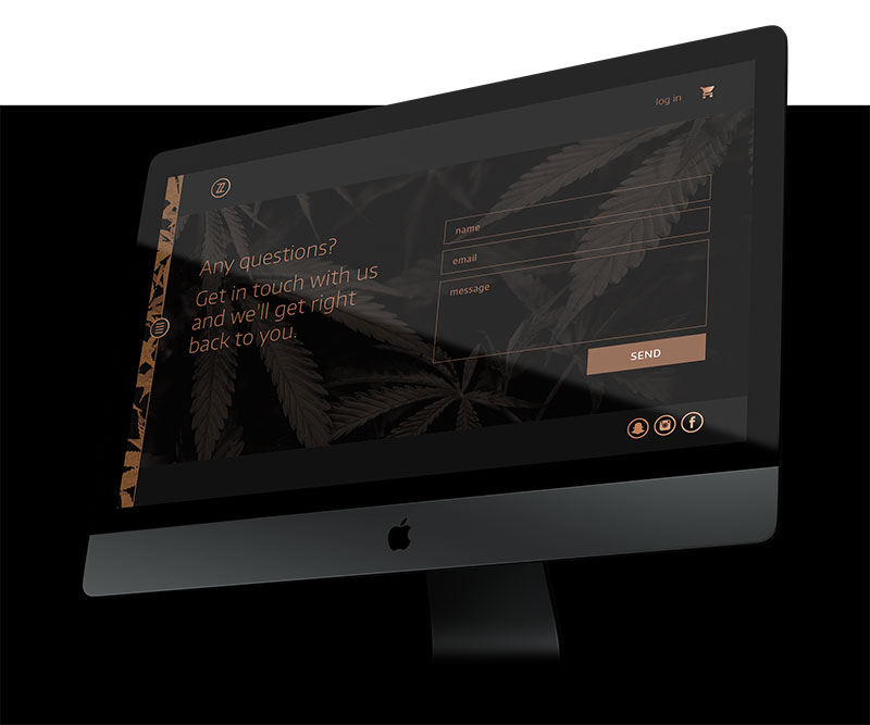
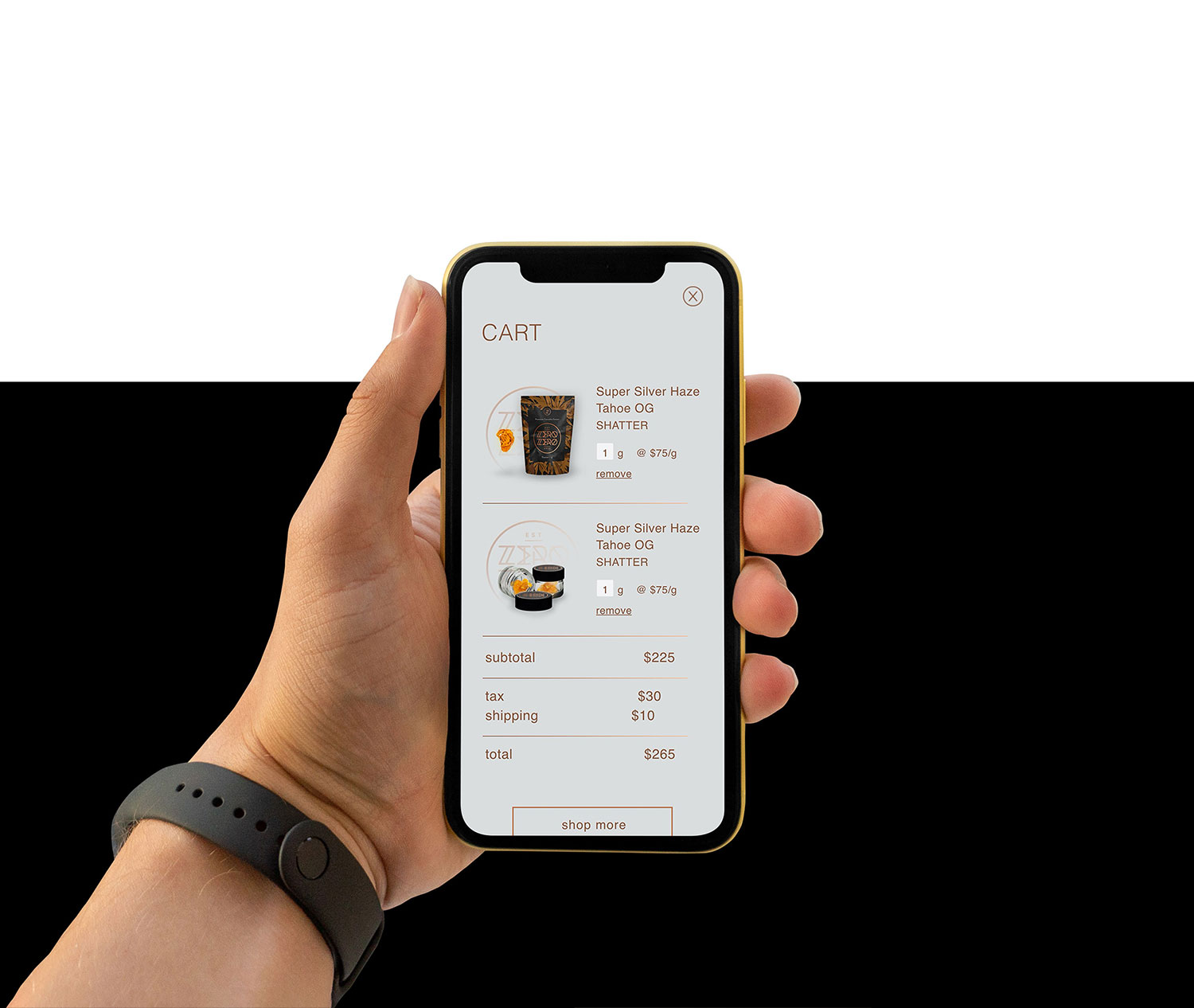
Website






Like what you see?
Join the ranks of satisfied clients who have seen their visions come to life with Eggbeater Studio. Fill out our quick quote form or just say hey – either way, let’s kickstart something extraordinary.